The people who need the number first are not sitting at a desk
The dashboards are correct and the news still arrives by phone call. What it takes to get one number into a pocket before somebody walks up the stairs.
Ask a plant head how he learns that a packing line has stopped, and the answer is usually that somebody walked up the stairs and told him. The data was there the whole time. The tag went flat at 06:40, a tile on the shift dashboard turned red, and that dashboard was open on a laptop in an office he had not sat in since the morning meeting.
The same shape repeats in other rooms. A regional manager hears that a store has been out of its best-selling line for three days because the store manager mentions it on a call about something else. A duty clinician learns the ward is near its staffing floor when the nurse in charge comes to find her. In every case a system knew first and a person did the delivery.
This gets described as a reporting problem, and it is not one. The numbers were computed correctly and on time. What failed was the last three metres, between a screen that was right and a pocket that was somewhere else.
A dashboard is somewhere you go
Dashboards are pull media. They assume a person with a spare five minutes, a browser and a reason to look, which describes an analyst well and describes almost nobody with an operational job. A shift engineer, an area manager and a charge nurse spend the day standing up, and the moment they have five spare minutes is precisely the moment nothing is going wrong. So the honest measure of a monitoring setup is not whether the number is correct. It is the gap between the minute the data could have told somebody and the minute somebody actually knew.
Teams optimise the first half of that gap hard, taking a pipeline from fifteen minutes to five and counting it as a win. The second half, from data landing to a human being aware, is frequently hours, and nobody owns it because it does not appear anywhere on the pipeline diagram.
Pipelines get tuned to the minute and then handed to a delivery mechanism made of people walking upstairs.
The pattern, stated plainly
A phone forces a subtraction that a dashboard never forces
The useful side effect of moving to a phone is that the medium refuses to carry everything. A dashboard can hold thirty charts, and eventually it will, because every request to add one is small and no request ever arrives asking to remove one. A notification has room for a line of text and perhaps a second line. Somebody has to decide which single number goes in it, and that argument is worth more than the technology that follows it. In practice the argument settles when you ask what the recipient would do differently in the next hour. If two candidate numbers lead to the same action, only one needs sending. If a number leads to no action at all, it is a report, and reports belong on a schedule people read when they choose to.
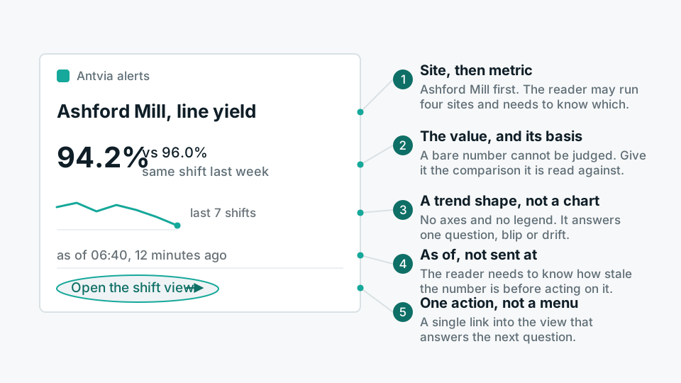
- The subject Which line, which store, which ward. A metric name with no subject attached makes the recipient open something else just to find out where to go.
- The size Not that a threshold broke, but by how much and against what. Thirty units below plan reads very differently from three, and the comparison basis has to be in the message, not assumed.
- The direction of travel Whether this is still getting worse while they read it or already recovering. That is the difference between leaving a meeting and finishing it.
- The as-of time The timestamp of the data, not the timestamp of the message. On a phone those two get confused constantly, and the confusion is expensive.
The number on the phone has to be the number on the screen
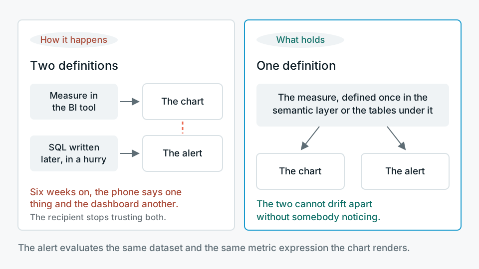
The quickest way to lose an alerting channel is to let it compute its own version of the truth, and it happens by accident. The dashboard measure was defined in the BI tool with its filters and its exclusions. The alert was written later, as a piece of SQL against the warehouse, by somebody in a hurry. Six weeks on the phone says one thing and the dashboard says another, and the recipient stops trusting both. The fix is unglamorous and structural: define the measure once, in a semantic layer or in the modelled tables underneath, and have the chart and the alert both read that definition rather than restate it.
In a Superset estate that means the alert evaluates the same dataset and the same metric expression the chart renders, so a change to an exclusion rule moves both at once. The point is not elegance. The point is that the two channels cannot drift apart without somebody noticing.
One person who can act, and a route for when they cannot
A distribution list is not a recipient. If eight people get the same message, each can reasonably assume one of the other seven is handling it, and on a bad night all eight assume exactly that. What an alert wants is a named owner for the shift, an acknowledgement, and a next stop if the acknowledgement does not come.
- 01OwnAttach every rule to a role per shift rather than to a person forever. Rotas change and people leave, and a rule pointed at an individual dies quietly with their account.
- 02AcknowledgeThe recipient marks that they have it. That single tap is also the only honest measurement you will ever get of whether the alert was worth sending.
- 03EscalateIf nothing is acknowledged inside a window, the alert moves on, and the window should vary by shift. Two minutes at 14:00 and twenty minutes at 03:00 are both defensible; the same number for both is not.
- 04SuppressOne cause should produce one message. If the ingestion job failed, twelve KPIs read zero and twelve alerts go out, the recipient learns that alerts are noise rather than that ingestion failed.
The mobile view is not the dashboard, shrunk
The reflex after sending the alert is to link to the full dashboard, and on a phone in a corridor that link is close to useless: ten charts at a fifth of their intended width, a filter bar that needs a mouse, a legend nobody can read. What the recipient needs is the smallest piece of context that settles one question, and the question is nearly always whether this is happening in one place or everywhere. One number, its comparison, a trend shape, and a short ranked list of the sites or lines contributing most of the gap. Then a link to the real thing, for whoever will sit down with it later.
Conditions matter as much as layout. Plants have reception dead zones and gloves. Wards have policies about phones at the bedside. Shop floors have people who will never install another application. That is why a good mobile companion to a plant system is deliberately read-only, and why mobile-first alerting, which is the whole of what Glimvia does, is built to be legible at arm's length instead of reproducing a desktop. Design for a thumb, in daylight, held at an angle, by somebody who is walking.
When the phone is the wrong place to send it
Some numbers should not go to a phone at all. If nobody can act inside the window the alert describes, it produces anxiety and nothing else, and the recipient is right to mute it. If the decision genuinely needs five charts and a conversation, a notification only starts that conversation later and worse than a scheduled review would. If the people who need the number are already standing in front of an operator screen on the line, a second channel splits their attention rather than adding anything.
There is one more case where our own approach is the wrong answer, and it is easy to miss. When the underlying process is not yet stable, alerting on it mostly documents the instability. Ten notifications a day about a machine everybody already knows is unreliable changes nothing; a maintenance decision does. Alerting is for the exception, and an exception needs a normal to be an exception to. So the check is not a tool review. Ask the plant head, the area manager or the charge nurse how they found out about the last three things that went wrong. If the answer is a person every time, the reporting estate is working perfectly and is not connected to the operation.