Fixed thresholds age badly, so alert on the change instead
A number chosen on a quiet Tuesday keeps asserting itself long after the business has moved on. Compare the metric against its own history instead.
The alert was written in February, on the afternoon the dashboard went live. If daily orders fall below four hundred, post a message to the operations channel. It fired twice that spring, both times for a reason worth knowing about, and everybody agreed it had earned its keep.
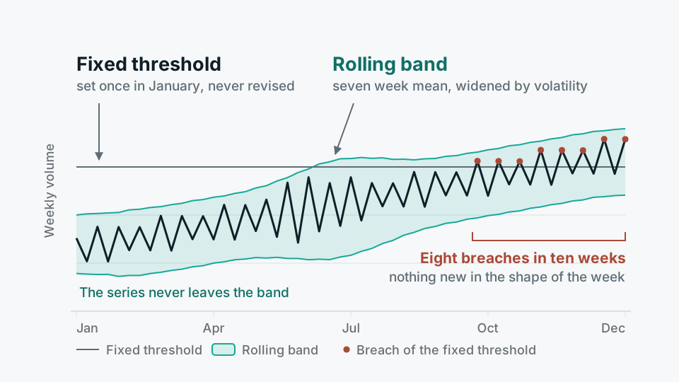
By November it was firing most Mondays. Nothing was wrong on those Mondays. The business had grown, the weekly shape had settled into a quiet start and a heavy midweek, and four hundred had drifted from meaning "unusually bad" to meaning "ordinary Monday morning". The team did what teams do. Somebody raised it to six hundred. A few weeks later, to nine hundred. Then somebody muted the channel, and when the checkout flow half-broke for two days in the new year, the first person to notice was a customer.
That arc is common enough to be worth naming properly, because the usual diagnosis is wrong. Four hundred was not a bad number. On the day it was chosen it was a good number, picked by somebody who knew the business. The problem is structural: a fixed threshold encodes a fact about one moment and then keeps asserting that fact long after the moment has passed. The metric moves. The line does not.
Four things pull the metric away from the line
Growth is the obvious one, and the kindest, because it drifts in a single direction and somebody eventually notices. Seasonality is harder, because it drifts back, so a threshold can look correct for six months and then produce a fortnight of noise every December. Calendar shape is harder still: day of week, month end, pay day, public holidays that differ by market. And then there is the quiet one, which is definition change. A new sales channel gets folded into the same metric, a second country goes live, a dbt model changes grain from order lines to orders. The series steps overnight, and every threshold sitting under it is now measuring something that no longer exists.
There is also a feedback problem that guarantees the decay. When a threshold fires wrongly, somebody is annoyed and the fix takes thirty seconds, and that fix always loosens the threshold. When a threshold fails to fire, nobody receives a message telling them so. One kind of error produces pressure and the other produces nothing, so any long-lived static threshold trends towards silence. The estate looks healthy right up to the moment you need it.
A wrong alert always produces a fix, and the fix is always to loosen it. A missed alert produces nothing at all.
The pattern, stated plainly
Compare the metric against its own history
The alternative is to stop asking whether today's value is above or below a number a person chose, and start asking whether today's value is unusual for a day like today. That single change removes almost all the maintenance, because the reference point moves with the business instead of being dragged along by hand.
- Same period last week Compare Monday with the four previous Mondays, not with yesterday. This is the cheapest useful comparison and it removes day-of-week shape entirely. It is enough for most operational counts.
- A rolling band Take the median of the last eight to twelve same-weekday values and a measure of spread, and fire when today falls outside. The band widens by itself when the metric is genuinely volatile, which is exactly when you want fewer alerts.
- Year on year, for real seasonality Only worth it where the annual cycle dominates and you have at least two clean years. With one year of history this is a comparison against a single observation, which is not a baseline.
The failure a threshold cannot see
This is the part that makes the change worth doing even if your thresholds are currently well tuned. When an ingestion job fails quietly, or an upstream API starts returning the last cached page, or a partition is written but never refreshed, the metric usually does not go out of range. It repeats. Yesterday's number arrives again today, and again tomorrow, and it is a perfectly plausible number, so a rule that says "below four hundred" stays silent for a week.
A baseline approach can catch this, but only if you ask it to. Alert on the absence of movement as well as the size of it: variance across the last several readings collapsing to zero, an identical row count for two consecutive partitions, a maximum event timestamp that has stopped advancing while the clock has not. A metric that has stopped moving is nearly always a broken pipeline rather than a very stable business, and it is the failure that survives longest undetected because nothing about it looks alarming on a chart.
The same argument applies upwards. Most alerting is written one-sided, watching for the number falling, because that is what people worry about. A metric that doubles overnight is either commercially interesting enough to want within the hour, or it is a join that started producing duplicates. Both are worth a message.
Where the comparison should live
- 01Fix the grain firstDecide what one observation is: orders per day per country, or shipments per hour per hub. Baselines are only meaningful within a grain, and mixing two of them is the most common reason a band looks unusably wide.
- 02Keep the history as a tableYou cannot compare against last month if last month was only ever a chart. A dated snapshot table in Postgres or the warehouse, written by the same schedule that refreshes the metric, is the whole requirement.
- 03Compute the band as a model, not as a settingExpress the median, the spread and the breach condition in dbt, where it is versioned, reviewable and testable. A threshold typed into a text box in a BI tool cannot be code-reviewed and will not survive the person who typed it.
- 04Require persistence before sendingFire on two consecutive breaches, or on a breach that is still true fifteen minutes later. Single-reading alerts on a noisy series will find something every day.
Tooling matters less than people expect. Superset alerts work by running a query and checking the result, so the entire comparison can sit inside the SQL and the tool only ever evaluates a boolean, which keeps the logic where the rest of your transformation logic lives. The orchestrator can do the same. What you are avoiding is a definition of "bad" that exists in four places with three different values, which is what happens when each tool gets its own threshold box. This is the design behind Glimvia, but the pattern is not proprietary and you can build it in an afternoon with a scheduled query and a table.
When a fixed threshold is the right answer
There are cases where baseline comparison is actively the wrong choice, and it is worth being blunt about them because the failure mode is silent. Contractual and regulatory limits are not estimates of normal, they are lines somebody will be held to, and a rolling band around them is meaningless. Capacity ceilings are the same: if disk usage creeps from sixty per cent to ninety-five over a quarter, the band moves with it and reports that everything is normal right up to the point the volume fills. Anything with a hard edge should be measured against that edge, permanently.
Two other cases. A brand new metric has no history, so it gets a rough fixed threshold for its first couple of months and a diary note to revisit. And a very low-volume series, where a normal day is a handful of events, defeats both approaches, because the noise is larger than any signal you could define. There the honest answer is to alert on the individual event rather than on a count of them.
The useful test for an alerting estate is not how many alerts it sends or how few. It is whether anybody still opens them without checking first whether it is a Monday. Every static threshold that has been quietly raised twice is a small piece of evidence about that, and it is usually the only evidence you get before the thing you were watching for actually happens.