Churn is three different measurements wearing one word
Logo, revenue and activity churn can move in opposite directions in the same quarter. If your deck shows one and the room is thinking of another
A quarterly review, twenty minutes in. The revenue lead says churn is the lowest it has been all year and puts a chart on the screen to prove it. The finance lead, working from a different tab of the same workbook, says churn is up and has been rising for two quarters. Nobody is lying, nobody has fumbled the arithmetic, and both charts were built off the same warehouse. They are reporting two different measurements that happen to share a name.
The third measurement is in the room as well, usually held by whoever owns the product. They know that a cluster of accounts stopped logging in months ago, are still being invoiced, and will not be renewing. On their reading, the churn already happened and both charts on the screen are lagging echoes of it.
Churn is not one metric with implementation details to be tidied up later. It is at least three separate questions about the same book of business, and they can move in opposite directions in the same quarter without anything being broken. The damage is not that the numbers disagree. The damage is that a single word lets a room believe it has agreed on something it has not.
Three questions, not three flavours of one
Each of the three answers something different, and each is the right answer to a different decision. Written out side by side, the differences are obvious. Written on a slide under the heading "Churn", they are invisible.
- Logo churn How many customer relationships ended. It counts accounts and ignores what they were worth, so a departing account weighs the same whether it paid two hundred a month or forty thousand. This is the honest read on whether the product fits the segment you are selling into.
- Revenue churn How much recurring money left. Weighted by contract value, so one large departure can swamp a dozen small ones, and a downgrade registers even though the logo is still on your wall. This is the number that governs whether you can hire.
- Activity churn How many accounts stopped using the thing. Defined by product behaviour rather than by a contract event, so it moves earlier than the other two. It is also the only one of the three that no document will ever settle for you.
A sales-led company usually means logo churn. A finance team almost always means revenue churn. A product team, if you press them, means activity churn and is frustrated that the other two arrive so late. All three are legitimate. The problem is entirely that the word does not carry which one you meant, and a chart title is not a definition.
They can move in opposite directions in the same quarter without anything being broken.
The pattern, stated plainly
The denominator is where the argument actually lives
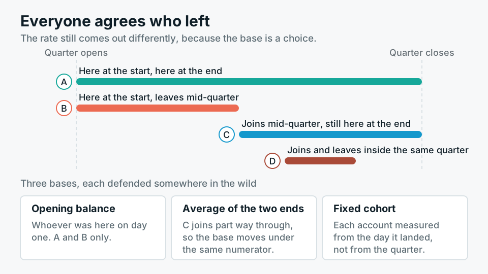
Two teams can agree on exactly which accounts left and still publish different rates, because the numerator is the easy part. The base can be the opening balance for the period, the average of opening and closing, or a fixed cohort measured from the day it landed. Customers who joined and left inside the same period can be counted in both, in neither, or only in the numerator, and each of those choices is defended somewhere in the wild. Then there is the question of whether a monthly rate is annualised by multiplying by twelve or by compounding, which sounds like pedantry until the two answers appear on adjacent slides.
Downgrades and pauses, the awkward middle
Most disagreements that survive a first round of cleanup are about accounts that neither stayed nor left. A customer cutting from eighty seats to twenty has not churned in any logo sense, but four fifths of that revenue is gone. If you report gross revenue churn, that shows up immediately. If you report net revenue retention, expansion elsewhere in the base can net it off, and you can publish an improving number in a quarter where every single existing customer shrank. Both are real measures. Only one of them is honest to call churn, and it is not the netted one.
Pauses are worse, because they are designed to be ambiguous. A seasonal customer suspending for four months, an account on a hold while their own funding lands, a downgrade to a free tier that keeps the data alive. You can treat a pause as churn with a possible reactivation, or as a suspension that never enters the numerator. Either rule works. What does not work is choosing one for the pause and the other for the reactivation, because then returning customers quietly reappear as new logos and your acquisition numbers start flattering you as well.
Activity churn needs a threshold, and the threshold is a decision
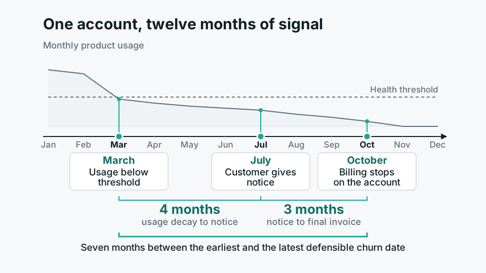
There is no natural definition of a customer having stopped using something. You have to pick an action that counts as use, a threshold of how much of it, and a window over which the absence has to hold. Thirty days with no session by any user on the account is a reasonable rule. So is a drop below half of the account's own trailing median. Neither is more true than the other, and arguing about which is correct wastes weeks. What matters far more is that the rule is written down, versioned, and left alone. Changing the threshold quietly is the single fastest way to make two years of history unreadable, because the series now has a seam in it that nothing on the chart explains.
Put the rule in the model, not in the chart title
The reason this keeps happening is architectural, not intellectual. The definition usually lives in the last place it was needed: a filter inside one report, a measure written by whoever built the dashboard, a saved query in somebody's folder. Each of those is a private definition that looks public. The fix is to move the rule upstream, into a modelled layer where it exists once. Build a table with one row per account per period carrying a typed status and reason, so that departures, downgrades, pauses and reactivations are all recorded events rather than things inferred later by subtraction. Define the rates on top of that in a semantic layer, so a report consumes a named measure and cannot quietly invent its own.
- 01Name all threeAgree that logo, revenue and activity churn exist and are different. Most of the argument dissolves here, because people discover they were never disagreeing.
- 02Write the counting rulesDenominator, churn date, treatment of downgrades, pauses and reactivations, and how a monthly figure becomes an annual one. One page, in plain language, with a version and a date.
- 03Model the events, not the rateMaterialise account-period status changes in the warehouse. Rates are derived from that. Anything derived from a rate cannot be audited.
- 04Expose named measures onlyThe BI tool gets logo_churn_rate and gross_revenue_churn_rate as defined objects. Nobody rebuilds the logic in a report.
- 05Reconcile once, in publicTake one disputed quarter and walk both old numbers to the new ones in front of the people who published them. Skip this and the old spreadsheets will outlive the new model.
The naming convention will look ugly and that is fine. A measure called gross_revenue_churn_monthly_opening_base is unpleasant to read and impossible to misunderstand, which is the correct trade. When someone puts it on a board slide, they can shorten the label as long as the underlying object keeps its full name and the definition page is one click away.
Where this whole approach is the wrong answer: if you have forty customers, a churn percentage is theatre. One departure moves it by two and a half points and the board will read a trend into noise that is really one account and one difficult renewal conversation. At that size, report the count, name the accounts, and say why each left. Percentages start earning their place when the base is large enough that individual stories stop dominating, and a good analytics team should be willing to say so rather than shipping a ratio because ratios look more professional.
The last uncomfortable part is that this is rarely a knowledge gap. Everyone senior already knows the three measures differ. The reason the ambiguity survives is that each definition flatters somebody, and an undefined word lets each function report the version that reflects best on it while nobody is technically wrong. Publishing the counting rules is not really a modelling exercise. It removes a negotiating position, which is why it tends to be agreed enthusiastically in the meeting and then not get done for two quarters.