Two dashboards, one metric, two different answers
Two teams, two revenue figures, one warehouse. The tool is almost never at fault, and fixing it is less a modelling problem than an argument nobody wants to have.
A finance lead opens the board pack on Monday morning and revenue for last month reads one number. The head of sales opens the pipeline dashboard fifteen minutes later and revenue for last month reads something else. The gap is not enormous, small enough to look like rounding, which is somehow worse than a large one. A large gap gets investigated. A small one gets argued about in the meeting and then quietly ignored, and both people carry on trusting the dashboard they built.
Almost every time we are called in for this, the tool is fine. Power BI is calculating exactly what it was told to calculate. Superset is running the SQL somebody wrote. The bug is not in the software, it is in the English. Two people, in two different quarters, wrote down what the word revenue means, and neither of them knew the other was doing it.
The interesting part of this problem is not technical. The modelling work takes days. The part that takes months is getting two departments to accept that one of their definitions is now wrong, and that the number they have been reporting to the board was, in a small way, not what they said it was.
The three places definitions usually differ
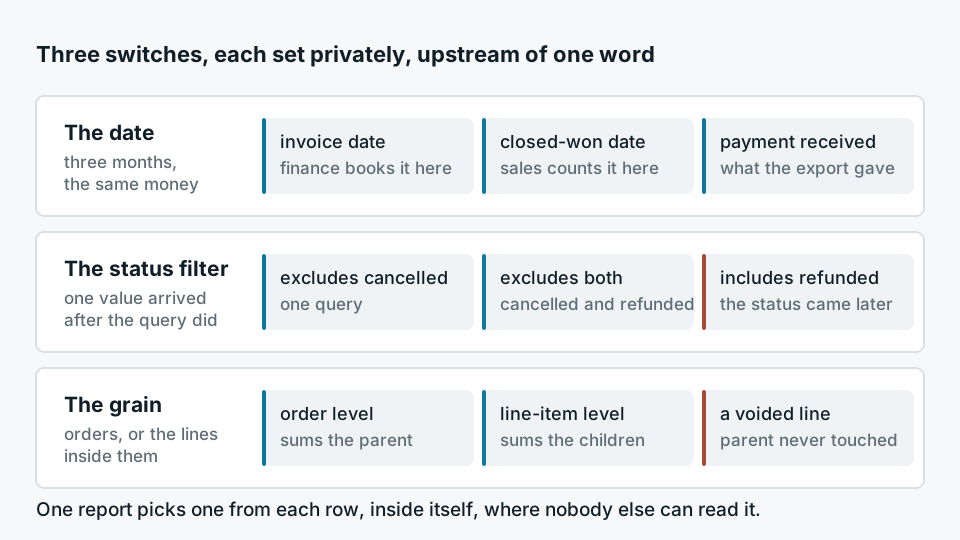
When we open both queries side by side, the divergence is nearly always one of three things, and often all three at once.
- The date Finance books revenue on invoice date. Sales counts it on the day the deal was marked closed-won. Somewhere a third report uses the payment received date because that is what the payments export gave them. Three defensible choices, three different months for the same money.
- The status filter One query excludes records where status is cancelled. The other excludes cancelled and refunded. A third was written before refunded existed as a status, so it silently includes them and nobody noticed when the CRM added the value.
- The grain One report sums at order level, the other at line-item level, and a handful of orders have a line that was voided without the parent being touched. This is the one people find hardest to believe until they see the rows.
None of these are mistakes exactly. Each was the right call for the question that report was originally built to answer. The failure is that the call was made inside a dashboard, where nobody else could see it, and then that dashboard outlived the question.
A definition written inside a dashboard is a private decision that everyone else is forced to live with.
The pattern, stated plainly
What a semantic layer actually does
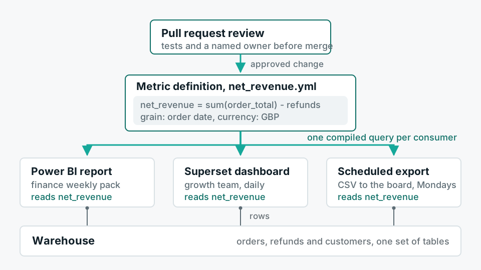
A semantic layer is a place, outside the BI tool, where a metric is defined once. Revenue is declared as a named measure with an explicit aggregation, an explicit time grain, an explicit set of filters, and an explicit set of dimensions it is allowed to be sliced by. The BI tool stops holding the definition and starts asking for it. If revenue changes, it changes in one file, and every chart that references it moves at the same time.
The reason this matters is not tidiness. It is that the definition becomes a diffable text file. It sits in the same repository as the dbt models it is built on. Changing it requires a pull request, which means someone else reads it, which means the change has a date, an author and a reason attached to it forever. Six months later, when someone asks why the number moved in March, the answer is a commit rather than a guess.
What it costs
This is where most articles about semantic layers stop, so it is worth being direct about the price.
You lose speed at the edges. Today an analyst who needs revenue excluding a particular reseller can write that filter into a chart the same afternoon and move on. After the semantic layer, that variant either becomes a governed measure with a proper name, which takes a review cycle, or it becomes an exception, and exceptions are how you end up back where you started. Teams that adopt a semantic layer and keep an unrestricted SQL escape hatch open for everyone tend to find, a year later, that a large share of the reporting has quietly migrated back into the escape hatch.
You also take on a maintenance surface. The layer has to be tested. A measure that compiles but returns the wrong number for one edge case is more dangerous than a spreadsheet, because it now carries institutional authority. And there is a cost dimension: pushing every query through a compiled layer against Snowflake or a similar warehouse changes your query patterns, and the bill can go up before it goes down, particularly if the layer defeats a caching pattern the old dashboards relied on.
There is a size below which none of this is worth it. If you have one analyst, a handful of dashboards and a shared understanding in one person's head, a semantic layer adds ceremony without adding truth. Write the definitions in a document, keep the dashboards few, and revisit when a second person starts building reports. We have told clients this and walked away from the build, because the honest recommendation was a documented convention and a smaller number of dashboards.
The part that is not modelling
Once you decide to do it, the sequence that works is not the sequence people expect. Nobody wants to start with the argument, so they start with the code, and then the argument happens at the end, when the code is already written and someone has to be told their number is being changed.
- 01Find the disagreements before you fix themPull every existing definition of the contested metric out of every report, put them in one table with their date filter, status filter and grain, and count how many distinct definitions exist. The count is usually higher than anyone guessed, and seeing it in a list does more to create consensus than any argument you could make.
- 02Name the variants instead of picking a winnerOften both definitions are correct for their purpose. Booked revenue and recognised revenue are different measures, not a dispute. Many of these arguments dissolve the moment the two things get separate names and both are allowed to exist.
- 03Get the real disagreements decided by a person, not a committeeWhere a genuine choice remains, one named owner decides, in writing, with the reason recorded. Committees produce a definition with an OR in it, which is how you get a metric nobody can explain.
- 04Write it, test it, and reconcile against the old numberProduce the row-level difference between the old dashboard and the new measure for a recent period. Not the totals, the rows. People believe reconciliations they can drill into.
- 05Retire the old reports, actuallyIf the previous dashboard stays reachable, it stays authoritative for whoever preferred its answer. This is the step that gets skipped and it is the one that decides whether any of the previous four mattered.
Step five is where most of these projects fail. Building the semantic layer is a technical exercise with a clear finish line. Turning off the report that a director has had bookmarked for years is a political one, and it does not have a finish line unless someone senior says out loud that the old number was wrong. If nobody is willing to say that, the honest thing is to not start the project, because you will end up with a governed metric and an ungoverned one, and now people have three answers instead of two.
A smaller version that often works
If a full semantic layer is more than the organisation can absorb right now, there is a cheaper intervention that captures a surprising amount of the value. Define the contested metrics as tested models in dbt, one model per metric, with the filters and grain visible in SQL and a test asserting the properties you care about. Point every BI tool at those models and forbid aggregation logic in the dashboards themselves. You do not get the flexibility of a compiled layer, and you will materialise more than you strictly need, but you get the important thing, which is that the definition lives in version control and changes leave a trace.
The tooling choice is genuinely secondary here. What matters is whether the sentence describing what a metric means exists in exactly one place that a human being is accountable for. Two dashboards showing different numbers is not a reporting failure. It is an organisation finding out, late, that it never agreed on the word.