Some questions need a button, not another chart
A report can tell you fourteen orders are stuck. It cannot let anyone unstick them, which is why the work quietly moves into a spreadsheet you never see.
The dashboard was correct. That was never in dispute. It showed fourteen orders that had cleared credit but had not been released to the floor, refreshed every fifteen minutes, with the ageing in days and the customer name against each line. The planner opened it every morning at eight. Then she opened a spreadsheet.
The spreadsheet was where the work actually happened. She pasted the fourteen rows into it, added a column for who she had already chased, another for the reason, and a third for what she planned to do that day. By Thursday it had grown far past the rows it started with, and it carried a filter she never turned off. The dashboard, meanwhile, showed a count that moved up and down all week, and nobody could reconstruct why any individual order had moved.
Everyone involved had done their job. The pipeline was sound, the model was tested, the chart was clear. The problem was that the number had never been the deliverable. A decision was, and the decision had nowhere to live except a file on one laptop.
Reporting problems and workflow problems arrive wearing the same clothes
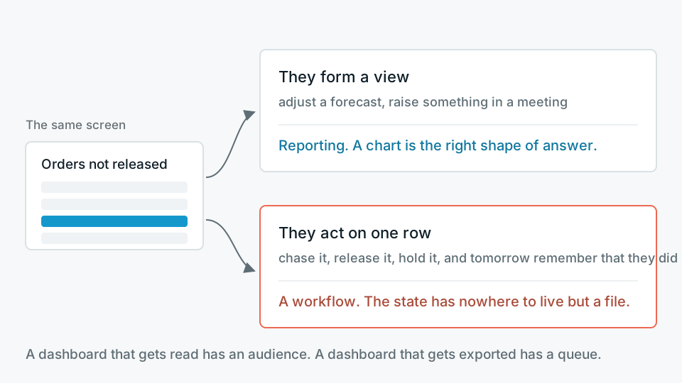
Both turn up as a sentence that begins "can we get a dashboard for". The distinguishing question is not about the data. It is about the moment after someone reads the number. If they form a view, adjust a forecast, or raise something in a meeting, that is reporting, and a chart is the right shape of answer. If instead they act on one specific row, and then need to remember tomorrow that they acted on it, that is a workflow, and a chart is the wrong shape however well it is built.
The most honest telemetry in any BI tool is the export count. A dashboard that gets read has an audience. A dashboard that gets exported has a queue. If the same small group exports the same view every morning, they are not analysing anything. They are taking a work list off a screen that cannot hold their work, and the state of that work is now outside your system entirely.
- Row-level and named The value of the screen is in the individual line, not the aggregate. People ask which orders, not how many.
- The same faces every day A small, named group on a fixed rhythm, rather than a broad readership that dips in occasionally.
- A verb after the number Chase, release, hold, credit, reassign, write off. Something changes in another system as a result.
- Memory is required Whether an item was already handled, by whom, and why, is information that only exists in someone's head or someone's spreadsheet.
- The count moves for unexplained reasons Items leave the list and nobody can say whether they were resolved, cancelled, or simply fell out of the filter.
What an application has to carry that a report does not
Read-only is a licence to be imprecise in ways that rarely cost anything. A dashboard can be five minutes stale. It can double count for one refresh cycle and self-correct. It can be quietly wrong for a row nobody looks at. None of that is good, but none of it changes the world outside the screen.
The moment a screen can write, that tolerance disappears, and a set of obligations arrives that reporting work never has to think about.
- Identity that means something Not a service account. The audit line has to say which person released the order, because in six months somebody will ask.
- One owner per field A column the application writes must never be recomputed by a scheduled model run. Pick the owner deliberately and enforce it, or the two will overwrite each other on a Tuesday.
- Concurrency you have actually thought about Two planners open the same row. The second save must fail loudly or merge honestly. Silently winning is the worst option and the easiest to ship.
- Idempotency at the boundary If pressing the button calls an ERP, a double click must not create two goods issues. The retry path is the design, not an afterthought.
- An audit trail as first-class data Every action written as an immutable row with actor, timestamp, prior state and reason. This is the artefact that answers the question the spreadsheet used to answer, and it is also the most analytically valuable table you will build.
- Failure states that tell the truth When the downstream call times out, the interface must not say saved. Most of the trust in an internal tool is earned by how it behaves on its worst day.
Once a screen can change something, staleness stops being a quality metric and becomes a safety one.
The pattern, stated plainly
The part people get wrong is where the state lives
The instinct is to bolt write-back onto the warehouse, because that is where the data already is. It works for about three months. Then a backfill reruns, or someone changes a join, and weeks of human decisions are gone with no way to tell what was lost.
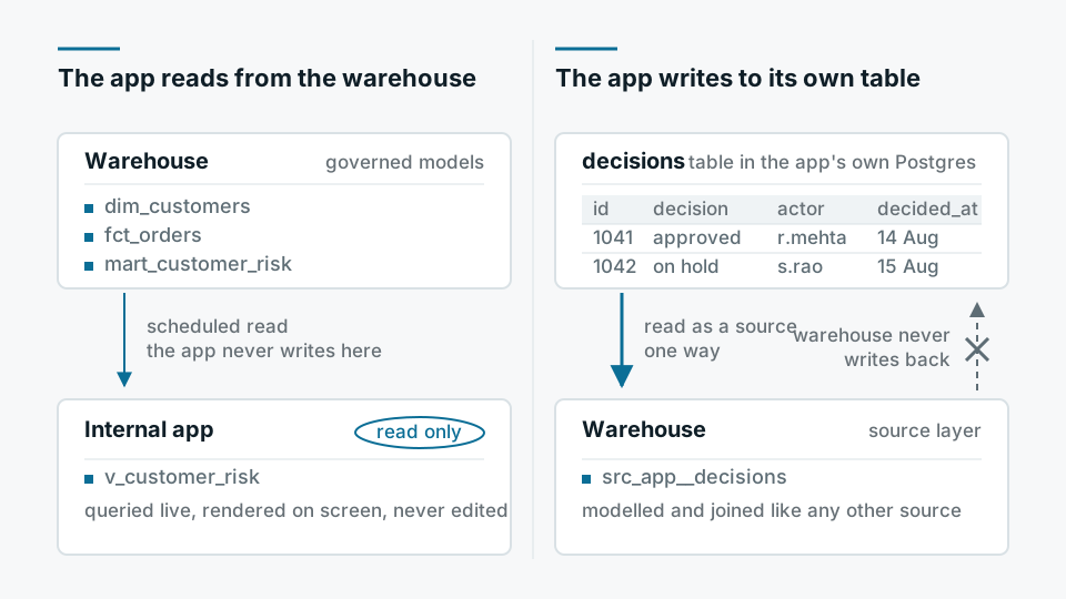
The shape that holds up is duller. The application reads from the warehouse, through the same dbt models that feed the dashboards, so the numbers on the screen and the numbers in the report cannot disagree. The application writes to its own store, usually a small Postgres database, which is the system of record for decisions and nothing else. That decision table is then ingested back into the warehouse as a source like any other. Analytics gets a fact table of human actions it never had before, and the dashboard can finally show not just how many orders are stuck but how long they sat before anyone touched them.
One decision, completely, beats five decisions partially
Scope creep in internal tools has a particular flavour. Once people see that a screen can do something, every adjacent frustration attaches itself to it, and the first release becomes a portal with five half-finished sections. Each one shows a list. None of them closes a loop. The spreadsheet survives, because the spreadsheet still handles the cases the half-built screen does not, and a workflow tool that handles most of a job, but not the awkward part, is a tool nobody adopts.
- 01Name the decision in one sentenceWith a verb and an owner. "The planner releases or holds a credit-cleared order." If it takes two sentences, it is two applications.
- 02Design the failure firstWhat the user sees when the ERP call fails, what they can do next, and how you reconcile. This shapes the data model more than the happy path does.
- 03Ship the list with the actions stubbedA week of watching people use a read-only version tells you which columns matter and which cases you had not heard about.
- 04Turn on one actionWrite-back for a single verb, with the audit table live from day one. Sit with the first real uses.
- 05Only then widenSecond action, then second decision. Adoption of the first one is the only evidence that earns the second.
Our engagements run on a fixed-fee audit in week one and build from week two, with a six-week median to the first production-grade artefact. For this kind of work, that artefact is deliberately narrow: one queue, one verb, one audit trail, in the hands of the people who were exporting the spreadsheet.
Where a language model helps here, and where it does not
There is a real role for Claude or any capable model inside a tool like this, and it is smaller than the demos suggest. Summarising a long email thread into the reason an order is on hold, drafting the chase message so the planner edits rather than writes, tidying free-text notes into a reason code that analytics can group by. All useful, all low stakes, all reversible by a human who is looking at the result anyway. What should stay deterministic is the state machine. Whether an order can move from held to released, and who is allowed to move it, is a rule, and rules belong in code where they can be tested.
When the honest answer is not to build it
Three situations come up often enough to name. The first is when the underlying data is wrong. An application makes people act on numbers faster, so a workflow tool laid over an unreliable model industrialises the mistake and adds an audit trail proving you made it deliberately. Fix the model first, even though it is the less interesting project.
The second is when the screen already exists in the ERP, the WMS or the order management system, and the real objection is licence cost or training. Building a friendlier version outside it creates a second system of record, and second systems of record lose. Sometimes the right recommendation is a few days of configuration and a training session, which is not a project we get paid much for and is still the correct advice.
The third is when the volume is genuinely small. If a handful of items a week need judgement from two people who sit near each other, a shared list and a standing fifteen minutes will beat anything we can build, and will not need maintaining in 2028.
The measure of whether this worked is not the launch. It is whether, a year on, the screen still gets opened before the spreadsheet, and whether anyone can answer why order 4471 sat as long as it did without asking the person who handled it. That answer used to live in a file on one laptop. It is worth more in a table.